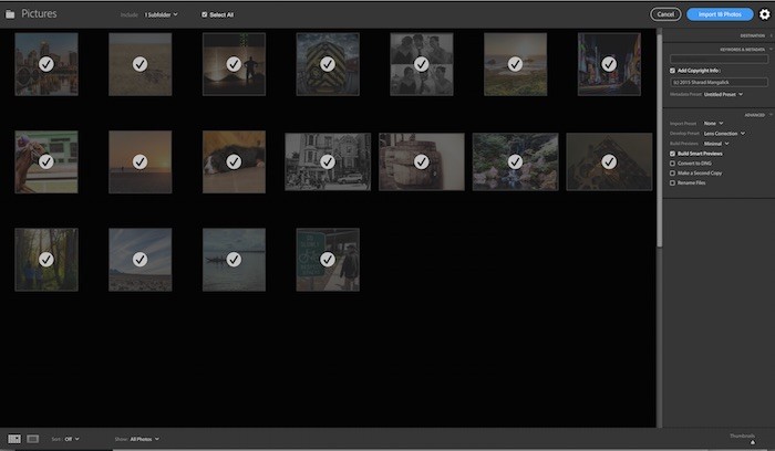
New Import Screen
Adobe updated Lightroom last week with Lightroom CC 2015.2 and Lightroom 6.2. In the update, Adobe provided a totally revamped import screen and process. The changes, according to Adobe, we implemented to make it easier for new users to import photos into Lightroom.

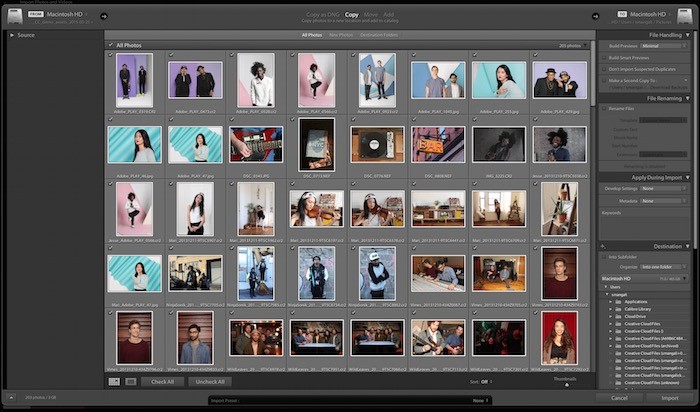
Previous Import Screen
Unfortunately, in dumbing down the import dialog, Adobe has taken away some features that some users have relied on for years. Many of these users are (somewhat justifiably) flipping out.
Adobe took away the Move feature during import. Only Copy and Add are options now. You can no longer allow Lightroom to eject your card after import. Duplicate photos can’t be imported.
Trying to organize on import using the into one folder setting instead of by date requires you to navigate to the designated folder via a system file menu (Finder on Mac) instead of using the simple file tree on the previous version of Lightroom, which clearly contained locations that were part of your existing catalog. Now, there is no indication that you are outside of your photo library and will be adding a new location.
Additionally, the entire file tree for the destination panel is gone. Previously, this showed you where your images were going and if the system was creating new folders for you. I can’t count the number of times, this preview helped save me from making mistakes of importing photos into the wrong location.
Thumbnail filtering by Destination folder is gone. Total file size is gone from the bottom left corner. The filename preview (when renaming) is gone.
Lightroom was a Professional Product
Emotions among established users are running high. Personally, I’m not a fan of the update either. Anytime you take away tools that users rely on every day, you are going to make people unhappy.
My first revulsion to the update was simply the appearance. It doesn’t look like a Lightroom panel or window. It looks and feels like an iPad app window and is completely foreign to the well-established Lightroom user experience. (I’ve been a Lightroom user since the pre-version 1 beta) On a smaller scale, I feel the same kind of reaction as when Apple introduced FCP X. It just looked like iMovie. Ok, but it’s not that extreme, I know.
But Adobe has dumbed the experience down and taken away features from power users. That’s not cool.
And this comes at a time when Adobe is adding more and more features to its apps but requiring you to subscribe through a monthly payment process in order to get them.
If this trend is going to continue, that’s not cool.
Lightroom needs to keep its power user experience in place because, at its core, Lightroom is a professional tool.
If Adobe wants to dumb things down for new users, then I have a better suggestion…
Make a Lightroom Elements Product
Isn’t that why we have the professional Photoshop application and the Photoshop Elements application?
Photoshop Elements introduces people to image editing and really holds their hands through the entire process. Why can’t Adobe do the same for Lightroom?
Now, if this all ends with the Import dialog, maybe that’s an overstatement, but if Adobe has plans to “revamp” the other modules and neuter powerful editing tools, then I hope that Lightroom Elements could be on the table…
Adobe can package a dumbed-down version of Lightroom along with Photoshop Elements until new users are ready to put on their big boy pants and step up to professional applications.
Copyright/DMCA Notice: The RSS entry was originally published on Photography Bay. RSSID#794326